I've had a bit of a break from the blog for a few weeks, as I've gotten more into data visualization in my spare time.
What's data visualization? It's a term that has become much more popular in the last fifteen years or so. It's what used to be called "charts and graphs" -- essentially, the visual display of quantitative -- or quantitative information. I've just become a member of the Data Visualization Society, a global organization of about 11,000 data visualization practitioners. It's just passed its first year and is a great resource for ideas. It's wonderful to be part of a community of people who love using visuals to tell stories.
When I think about the relationship between sports and society, I often think of the sports world as a great breeding ground for data visualization. Sports is so full of data and statistics, and novel ways of displaying them, as anyone who spends a lot of time on ESPN's Web site knows.
One of the best-known experts in data visualization is Edward Tufte, who has wrote a pioneering series of books and leads one-day workshops across the country. I first learned about him from one of my managers at work. He provokes strong opinions; often for his strong views about simplicity and design. That said, I've often found his work to be useful in establishing some fundamental guiding principles about visualizing data: namely, that it shouldn't be only for data visualization's sake and that each picture needs to make a very specific point.
Which brings me to ways in which we can use data visalization in sports. One of the biggest issues in sports is the Houston Astros sign stealing scandal. There has been a great deal written about this, and all I'll say is that it's deeply frustrating that the players who conducted the sign stealing and communication to batters aren't being held accountable in any meaningful way.
That said, data visualization can help us understand not so much how the cheating happened, as whether it had an impact on games. And I would say that the jury is still out on that, but I've developed a few charts that illuminate whether there could have been any impact at all.
A few relevant points:
- For my data source, I used the Lahman Baseball Database, which is publicly available here.
- I compared the Astros to the teams they played in the 2015 to 2018 seasons: the Red Sox, Yankees, Royals, and Dodgers.
- For my data visualizations, I used Tableau Public. This is the free version of Tableau, which is one of the leading data visualization packages. I'm not going to endorse any specific package, but Tableau is what I use at work and I'm most familiar with it. Other data visualization packages include Qlik, Microsoft PowerBI, and Google DataStudio.
- For other data visualizations I'm working on, you can check out my personal profile on Tableau Public here.
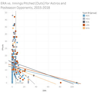
The first question I wanted to answer was whether there seemed to be an impact on pitching. The mean ERA is 5.9 (noted the grey line), and the diagonal lines show the trends between the average number of innings pitched per out on the y-axis and the team ERA on the x-axis. As you can see below, the Astros trend line (in grey) starts on the left with a similar IP/out ratio, but a much lower ERA. (In other words, the ERA "tail" is much shorter than for the other teams. This could mean that the Astros pitching was just better. But it also means that there were some outlier pitchers who were hit very hard.
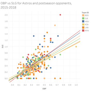
Now, let's look at hitting. Here, I plot slugging percentage (SLG, a measure of how many bases a hitter typically gets, which weights hits depending on the number of bases) against on-base percentage (basically, the percentage of plate appearances in which the batter gets a hit, walk, or is hit by a pitch). There's not an exact correlation but the relationship is positive, and it's clear that on average the Houston hitters were second only to the Yankees throughout these four posteasons. Again, it's possible that the Houston hitters were just generally good.
Again, the data visualization does not state authoritatively whether and how the Astros cheated. However, it does show that their pitching performance was markedly better, particularly among outliers that for other teams seemed to get rocked. This supports the narrative that we've seen about the scandal, that the Astros were able to tip off their hitters who had very big innings at certain periods during the regular season (not tracked here) and the posteason. I plan to continue this analysis, and look forward to comments and further discussion on the topic.
Data visualization isn't the whole analysis or the whole argument, but done well, it can help drive discussion and insight. And it's fun -- so I'll be writing more posts like this.
Data visualization isn't the whole analysis or the whole argument, but done well, it can help drive discussion and insight. And it's fun -- so I'll be writing more posts like this.


Comments
Post a Comment