It's been such a joy over the last six months to have created so many card paintings, and I still have lots of ideas about new ways to create new paintings from old cards. It's going to be a while before I get to the bottom of this well. This week, I spent some time reflecting on what led me to start making card paintings, which I wrote about in a guest post for SABR's Baseball Card Research Committee blog.
I've also been thinking about some new directions to follow. One of them is to think creatively about the format of my paintings, and not limit myself to the size of a baseball card. I wanted to make some paintings that were larger in format, but still lent themselves to at least some of the proportions and conventions of baseball cards. The recent Josh Gibson art show and contest, with 75 card artists focused on elevating Josh Gibson and supporting renaming the MVP award for him, helped advance my thinking.
In doing this, I wanted to bring in my experience in data visualization, which is something I've been focused on over more than twenty years spent in business research. In a visual world, it's so important to be able to show important ideas in pictures. Research shows that we retain and understand visual information much more quickly, and more effectively, than raw facts or data.
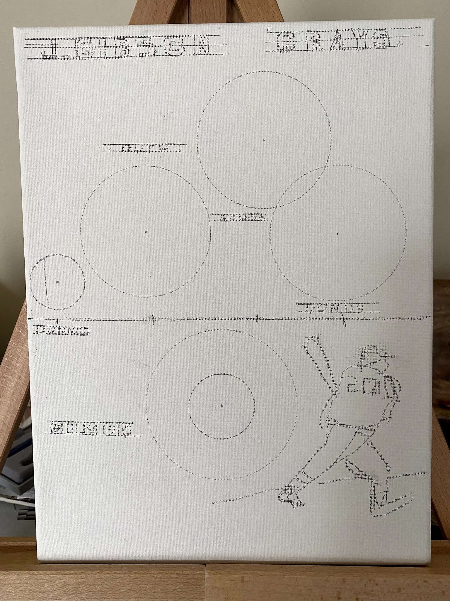
I've been very struck by how little we know about the Negro Leagues. After all, their very existence is because of the systemic racism of professional baseball and the unwritten agreement among baseball owners to exclude Black players, at all levels, for the first half of the 20th century. While Negro League teams only played about 60 games every season against each other (compared to 154 for the White major leagues), they played far more games on barnstorming tours and in exhibitions that weren't documented in the way major league games were. Josh Gibson himself hit anywhere from 165 home runs -- the number documented in Baseball Reference -- to 962. I wanted to show this ambiguity in visual form, and also elevate Josh Gibson's achievements to the realm of the best home run hitters in history.
I created this data visualization in Tableau Public to compare the career home run leaders to Hall of Famers, retired players, and current players.

The full dataviz is interactive, and I encourage playing with it to filter it by class of player, and to find favorite players. But it's too complicated to paint on a canvas. To simplify it, my first step was to interpret the number of home runs for the four hitters who have officially claimed the career home run title since 1897. It's amazing how different the dead ball era was, such that Babe Ruth retired with a home run total more than five times larger than Roger Connor's. (I am including Barry Bonds, despite his steroid issues, and I do not include Sadaharu Oh, who hit 868 home runs in the Japan Central League, though there may be a strong argument for doing so.) I used the table below to convert the relative numbers of home runs to the areas of circles.


Comments
Post a Comment