
The prime motivation for the talk is to walk through how I built the poster (which is below), but also to offer some general thoughts about how to visualize data. I'll link to two of them here:
- The Visualization Universe is a Web site that contains dozens of kinds of datavisualizations, explaining what each one means and also showing how common they are over time. This is a great resource if you are new to the practice and just need some ideas about how to get started.
- This page on Gestalt principles -- ideas of visual design that come from German psychology but are still applicable today -- are helpful to get started thinking about design.
Below are the graphics that I talk about in the presentation that explain several "what-ifs":
- What if we could show whether the 2020 season--limited to 60 games because of the COVID-19 pandemic--was no different from past seasons?
- What if we could show whether the level of play in the Negro leagues was the virtually identical to that seen in the White major leagues during the "golden years" of 1920 to 1948?
- What if we could get a visual overview of the All-American Girls Baseball League?
The charts we'll be discussing are interactive--you can see them on my Tableau Public profile. Take some time to look at each chart, and mouse over the dots that either represent a single player, or a team (in the case of the Negro Leagues). It's a totally different way to see the data and make them come alive.
The final "what if" is one that resonates with a lot of baseball fans: what if we could make baseball cards interactive? We're used to our cards showing data the same way that they have for more than seventy years.

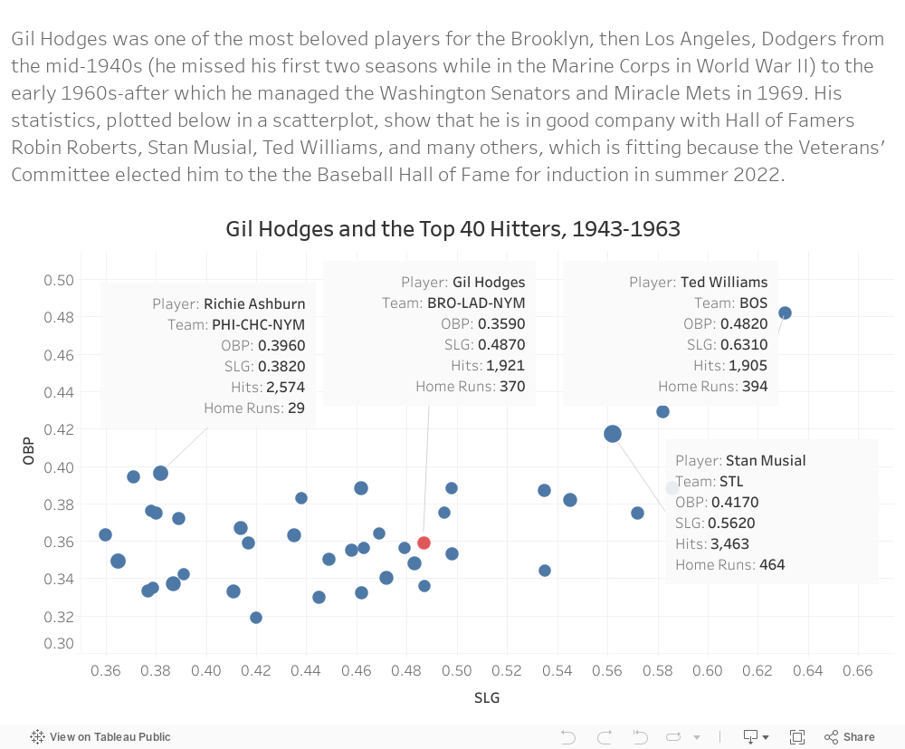
Now take a look below to see what the back of Gil Hodges's card could look like-and be sure to mouse over each dot to see the stats for his peers during his career.
UPDATE: Thanks to the Vermont SABR chapter for a great discussion last night! I'm linking to the slide deck, but if you have the time, it's very much worth your time to watch the recording with some outstanding questions about the role of analytics and data visualization, design principles, and audiences. It's all part of a very worthwhile discussion. Please do reach out here or on Twitter with your thoughts and questions!
Comments
Post a Comment