There's a tension in data visualization between making images that are beautiful -- often visually complex, with a great deal of information that the audience can uncover just by moving a cursor over it -- and visualizing data and information in ways that are simple and clear -- and yes beautiful as well, but balancing aesthetics with clarity. The Information is Beautiful Awards have just released their "long list" of submissions (full disclosure: I submitted an entry but it didn't make the cut), and they are extraordinary. You can see those that did here.
It says a great deal about the technological advances that have occurred in the last twenty years that we can so easily create visualizations that contain so much data, that one can interact with in so many interesting ways, with nothing more than an Internet connection. But the more that I talk with fellow SABR members, and with people who are interested in baseball, history, analysis, and the intersection of the three, the more that I hear from people who are skeptical of data analysis, or the importance of visualization generally. For some, it's a discomfort with using unfamiliar computer applications; for others, it's a strong feeling that stories and strategies drive knowledge, not numbers.
In any case, while I work often in Tableau for data analysis, it's important to be "tool agnostic" in this or any discipline. The principles of what works and doesn't work don't depend on what tools omne chooses, and there are four that fall under an important principle of accessibility.
In the data visualization class that I teach at MICA, we often work with two fundamental principles of data visualization in a world where all of us are constantly bombarded by a huge volume of visual information.
The first is that the way that we communicate visually has to balance simplicity, clarity, and beauty. A graphic that is aesthetically beautiful may be so complex that audiences can't easily understand its meaning. (There's the idea of a "seven second test," which means that a graphic that a viewer can't fully comprehend within seven seconds is too complicated.) On the other hand, a graphic that is too simple can insult the audience's intelligence or not be compelling enough to draw its attention.
This leads to the second principle: that as data visualizers, we often make tradeoffs between beauty and clarity. And it's the idea of these tradeoffs that led me to think about the most exclusive club in professional baseball: the list of six players who have hit more than seven hundred home runs in their career.
The 700 Home Run Club
The most exclusive achievement in major league baseball is hitting seven hundred home runs in a career. It's more than four times as rare as a perfect game; while 24 pitchers have pitched a perfect game, only five in the U.S. major leagues have reached 700 home runs. (Not included in this list is Josh Gibson, who may have hit as many as 800, but is credited with only 165, and Sadaharu Oh, who hit 868 home runs in the Japan Central League.) I've also included Roger Connor, who held the record of 138 career home runs before Babe Ruth.
How I Made It
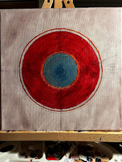
I wanted to visualize--in a way that was as accessible as possible, not limited by language or computer skills--how rare and notable the achievement is. I started thinking about how I wanted to visualize these seven home run totals. I thought of bright, bold (but not excessively so) colors; something that was easy to understand, especially for people who are unfamiliar with baseball; and something that was understandable without needing to interact with an online tool. I thought both of W.E.B. DuBois's data visualizations--which predated online tools by more than a century-- and the bullseye paintings of Kenneth Noland.
I made two sketches with colored pencils, both playing with the idea of showing the number of home runs as the areas of different colored circles:
I chose the version of the right because it shows the relative sizes of the home run totals-from Roger Connor's to Sadaharu Oh's-very well. (Note that there are two bands for Josh Gibson - one representing his "official" home run total of 165, and another representing that he may have hit as many as 800 during his career.)
Taking this visualization off of Tableau and onto canvas meant that I had to calculate three data points on a Google Sheet:
- The relative area of every player's home run total, using multiples of Roger Connor's total;
- The relative radius for every player (using the formula for the are of a circle, A=𝜋r^2; and
- Factors for multiples of 2, 3, and 4 times that radius, so that all of the cirles would fit on a 12 inch by 12 inch canvas.


Comments
Post a Comment