Since August 2021--whew, about four months ago--I've had a great deal going on and haven't posted since then. My calendar became much busier in the spring when I began teaching in the graduate Data Analytics and Visualization program of the Maryland Institute College of Art, one of the nation's oldest art schools and, in the last few years, an innovative program for graphic designers and researchers who want to upgrade their data visualization skills. It's been an amazing experience. My students have included professors, graphic designers, artists, theater producers, and consultants -- and it's been fascinating to be on a journey with them to build their portfolios and expand their practice of using data to get points across.
My latest card is of Gil Hodges, the beloved Brooklyn Dodger first baseman who later managed the Washington Senators and, in the miracle year of 1969, the New York Mets. For the front of the card, I made an original painting based on his 1957 Topps card. He is a much-loved player, especially by Brooklyn and Mets fans. I painted him in the style of a Russian or Eastern Orthodox icon because his unexpected and early passing, coupled with his reputation for fair and evenhanded play, has made him a saintlike figure.
I've also been creating more card art. In particular, I've been creating more ways linking data visualization to baseball cards. I'm still doing paintings on vintage cards, but I've also been creating original cards based on canvas paintings on the front of the card, and data-intensive scatterplots on the back. (You can see the results on my Etsy shop, and see my earlier cards here.)
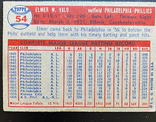
Underpinning this artistic effort has been a great deal of thinking and work about opportunities to expand the use of data visualization in baseball research and analysis. As fans are incredibly well aware, baseball has a century and a half-long tradition of keeping statistics. A visit to Baseball Reference or Stathead will bear this out. While baseball cards have evolved a great deal over the past seventy years or so, with different designs, forms of photography, graphical elements, and paper stock, the back of the card in 2022 is awfully similar to the back of the card in the great Topps 1957 set.
 |
The back of Elmer Valo's 1957 Topps baseball card, showing his career statistics in a spreadsheet format; still familiar in 2022. |
It's a small spreadsheet, with a type that gets smaller and smaller as the player's career gets longer, featuring statistics for each year including games played, runs, hits, home runs, et cetera. (With the growth of SABRmetrics, it's now common to see stats like SLG, OPS, and WAR in addition to batting average.) But in a graphical, visual world, the back of a baseball card is pretty much the only place where one routinely sees basic spreadsheets as the final form of data visualization.
As I've become more involved in teaching data visualization and expanding the role of analytics in m organization at work, I've started to look more at the back of the card and think about how visuals can show a data story in that small, 2.5 by 3.5-inch space.
It's a tall order, especially since my eyes are much less tolerant of smaller fonts than they used to be. In my first couple of attempts, I talked about them here, and I liked how they turned out as proofs of concept that it was possible to visualize a player's career. I was less pleased with the ability to read them, some of which had to do with the choices I was making for printing and some of which may have been because the file resolution was too low.
 |
| On the front of the Hodges card, in acrylic in the style of a church icon |
For the back, I created a scatterplot showing how Hodges career compares with those of the 40 top hitters during the years he played (from 1943 to 1963, though he missed his first two seasons while with the Marines in World War II). The graphic shows him to be in the very good company of hitters like Richie Ashburn, Ted Williams, and Stan Musial--which is very fitting considering he was voted into the Baseball Hall of Fame for induction this summer.
 |
| The back of the card, with a data visualization showing Hodges's career statistics compared to his peers |
I think that I've hit on a good theme, and will continue to explore data visualization cards (in addition to painting directly on vintage examples). Please comment below about what baseball data you would like to see visualized--and stay tuned for some other projects I'm working on to visualize baseball data. My next post is going to focus on some work I've been doing as the follow-up to a new SABR/Baseball Reference book about the integration of the Negro Leagues' body of statistics with Major League Baseball, and their overdue recognition as a major league.
The sport -- and the community of baseball fans and analysts -- have a huge opportunity to use data visualization as a tool for understanding just how good Negro League players were, and how we can think of the leagues as a cohesive group of players. It's been a long time coming. Baseball, like so many American institutions, is facing a reckoning about how it has treated Black and Latino players, and visualizing data can help navigate that journey,
Comments
Post a Comment