
This has been quite a week -- my article on visualizing AAGPBL data was published in Nightingale, the Data Visualization Society's journal; Qualtrics recognized me for being part of their online insights community; and I gave a presentation to SABR's Vermont chapter about how to use data visualization in baseball research. Now I'm able to come up for air -- I've also had a lot going on in my "day job" -- and to think about some of the ideas that came up in the course of talking with the Gardner-Waterman Chapter. (Click here for my last post that walks through my talk in more detail.)
I love these conversations because they center on the amazing sport of baseball, which dates back to the 1850's and probably earlier. (The first major league team, the Cincinnati Reds, dates to the 1870s). The audiences are always interesting and diverse in age, as well as in interest -- some come being very comfortable with data and analysis, while some take a much more historical, qualitative, and skeptical perspective. The discussions often become, on a smaller scale, a similar debate to what many organizations experience when they start to embrace data, statistics, and analysis, which goes back to the very fundamental principles that lead people to the topic to begin with. Two of those include:
The tension between acquired knowledge and visual data: In any field, whether baseball, business, government, or others, there is always a tension between acquired knowledge and experience, gained from years in the field, and data-based analytics and visualization, which longtime experts might view with skepticism or even contempt.
One of the issues that I think analysts and visualizers often have is that they see themselves as unbiased, objective experts in how to do analysis. That objectivity may be there, but one has to put it in a context that still respects the deep experience that audiences probably have with the topic. Someone who has a deep experience looking at baseball data over the course of decades might or might not buy my analysis. They might agree with the conclusions, or might feel that the analysis is emphasizing numbers that really don't describe the problem or the solution.
In some cases, audiences may be uncomfortable with the analytics, or the visualization, because they fear being left behind or having their wisdom questioned by people who don't understand or appreciate their work.
So what really needs to happen is to connect the dots -- to make clear that the value of the data is not in showing a "single source of truth" beyond what intuition and experience give, but rather to put the field in the position where experience and knowledge benefit from analytics to suggest numbers-based insight, but the analytics also benefit from experience and knowledge to put that insight into context.
The experience of interacting with visualized data: I do lots of presentations in my line of work, both for what I get paid for (as an analytics lead and subject matter expert in visualization and analytics, and as a professor of data visualization) and what I do for fun. Out of necessity -- especially when most of the interactions are onscreen -- we tend to present visuals as static pictures. This is often fine, but it doesn't account for the benefit that navigating through an interactive visual can give.
The discussion that happens when instead of saying "here is what this graphic says," as opposed to the deeper experience that one has when they hear "take some time to explore this graphic, and then talk about what you are able to uncover what it means for you" is not necessarily less, but it's one that tends to be more passive, and less encouraging of audiences to find their way around the data and develop ideas for themselves.
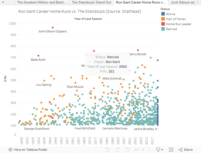
Just take a look at this interactive Tableau workbook below -- and hover over each one of the dots that shows how many home runs the greatest hitters of their ages it every year from 1897 through 2021. It's a very different experience than just seeing a static chart!
Comments
Post a Comment